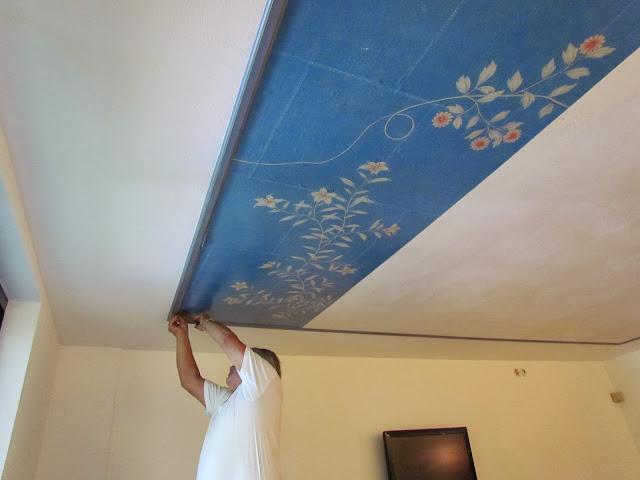
I am so pleased with the end result, especially on the ceiling as it really helped create a very serene environment in which the families can truly feel as though they were embraced by love and warmth as they look into the blue sky above...
 |
| Jennifer & Mike Gracie |
With an 8ft ceiling but a room with a very awkward trapezoid shape, I wanted to draw your eye in and help establish a more ample and regular space through the trim and wallpapered ceiling.
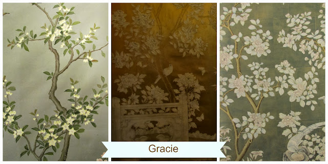
While I was working on the design of the room, I remembered that a while back I had received an email from Jennifer Gracie and decided to reach out to her crossing all my fingers and toes in the hopes that they would be willing to partner with me and create some of their amazing wallpaper in the name of this great cause.
Wouldn't you know it, they welcomed the idea wholeheartedly and off I was rushing to their great showroom at the D&D Building to have a first look at all the options available to me. A family run company, since its inception in 1898 and with modern day clients such as Tory Burch, that also included Gracie as part of the backdrop to last season's New York Fashion Week runway..
 |
| Tory Burch Instagram feed |
 |
| Images: Christopher Sturman, Elle Magazine |
I knew I was in great hands. The options are tremendous, from Vintage and Antique panels in sepia, black and white all the way through the color spectrum to any custom color a designer could dream of.

 |
1. SY-500 Mid-Century Slate 2. SY-239 Gilded Garden 3. SY-216 Slate Forest |
 |
| 1. SY-650 Mint Blossom 2. GT-6 Gold Fret |
But once I considered all of my options, I decided on this panel. I really liked the tree, branches and flowers and felt that they would be soothing and yet still captivating for both my entry and ceiling treatments.
 |
| SY-205 Caroline Street |
Initially we tried to leave the original background color, but as I wanted to have the lacquered finish we needed to select a different ground. This meant that the paper would have a stone like pattern to it, almost creating the illusion of panels within the panels..
But once they began, it just didn't feel right. So we sent the artists a sample of the Brunshwig et Fils fabric as a source for the blue I really wanted as the background (as seen above) and they recolored the paper sample for me .. Perfection!
The panels were quickly coming to life, and we were busy preparing the room and when I say "we" I actually mean Oliver Marinovic and his team ~ that added the trim molding to enclose the space within the ceiling, and frame the closet area all awaiting he paper installation.
With the greatest care, and attention to each detail. Matching the seams, ensuring that each flower was of equal distance .. honestly, it was a very long day but well worth the end result!
Over the course of the next few weeks I will continue the Before & After series moments of mine as well as all the rooms with special focus on the amazing brands that have made it possible for me to participate:
à CUSTOM WINDOWS – (203) 231-3659 Contact: John Hayes
à KRAVET – www.kravet.com
à OLIVER’S HOUSE PAINTING, LLC – T: 914 954-3742
à STARK - www.starkcarpet.com Contact: Adam Khan - T: 203-899-1771
à THE FINISHED WALL - Contact: Angela Capan & Nancy Schadt. www.thefinishedwall.com
à THE FINISHED WALL - Contact: Angela Capan & Nancy Schadt. www.thefinishedwall.com
Please make sure to visit each of their websites, as they are simply amazing!
Open October 11-14th ONLY. This is an event you do NOT want to miss!
Call 516-775-5683 x129 to reserve your tickets today! Kravet NYC&G
Designers participation: Amanda Nisbet, Anthony Baratta, The Breakfast Room, Bunny Williams, Core Consulting, Danielle Colding Design, Delrose Design, Drake Design Associates, Drew McGukin Interiors, Dwell Studio, Elaine Griffin Interior Design, Eric Colher, Kate Singer, Kim E Courtney Interiors & Designs, Mabley Handler Interior Design, Margreet Cevasco Design, Matthew Patrick Smyth, Meg Braff Designs, Mehditash Design (thats me!) Michael Herold Design, Michael Tavano Design, Mr Call Design, Nick Olsen, Pappas & Mirron Design, Tilton Fenwick Young Huh Interior Design,


0 Response to "Before & After: Gracie Wallpaper for Ronald McDonald Project Design"
Posting Komentar