Hello dear readers, and Happy Memorial Day Weekend!
Let me delight you this long weekend with a continuation of my visit of the Kips Bay Decorator Showhouse from the last post, Layers of Elegance, today I wanted to share how many of the designers took on the use of WHITE in very successful ways.
Whether white was the predominant color such as in the design by Daryl Carter, that took on with many entrances and doorways, and yet was able to create a place of solace and rest with various areas of reading and lounging through a creative layout and floor plan.
 |
| image courtesy - Kips Bay |
The space is an assemblage of meaningful pieces – represented with classical antique shapes in conversation with modern forms. Varying in nature, they capture attention by complexity, utility or even humor; and serve as an homage to the refined envelope - Daryl Carter
Personally, in my own design schemes, white is most certainly not my "go-to" color as a base throughout my own design schemes. I enjoy the layering of texture and color too much, however I can so greatly appreciate how difficult it is to achieve a successful design scheme while using white tones as your primary.
In the case of Daryl's room, I think he did just that!
With a whimsical brush stroke and sense of humor, Daryl keeps the palette very subdued and yet for those that take the time to enjoy this room and all of it's many details, it really is exceedingly well 'composed'.
 |
| image courtesy - Kips Bay |
Carrier & Co. Interiors.'s designers, Jesse Carrier and Mara Miller, featured AD 100 and Elle Decor "A List" of top designers here create an asymmetrical lounge layered with gold tones on white.
 |
| Stanley Schoen mirrored wall - image courtesy of Kips Bay |
The highlight of the room, a Calico Wallpaper, also featured at this year's ICFF last week, creates a marbleized pattern which plays so nicely against the more traditional paneling as seen in this "BEFORE" shot.
 |
| Calico Wallpaper - Kerson Gallery mirrored console image courtesy Kips Bay |
Mirrors, artwork and decorative accessories skillfully placed enable us to appreciate the many areas of this room.
The warm charcoal gray drapery panels, frame the view and act as an anchor for this otherwise light and reflective space..
with the lush fabrics of Pierre Frey throughout the room, how could they go wrong?!
 |
| David Tood in Kips Bay |
San Francisco based firm, ODADA - Mr. Diaz-Azcuy, David Todd Oldroyd and Greg Stewart, all have strong architecture and art backgrounds, and showcase their talent in this design.
 |
| image via (Architectural Digest) |
Taking on this room particulalry posed a challenge to this team, as the lighting feature in the ceiling, with its very strong blue light was a feature that could not be removed nor manipulated in any way.
 |
The wood paneling may also have been off putting to some designers with it's very strong traditional feel, however they took it all in stride and very creatively added these white panels encapsulating the room within the existing room to allow for a transition into a more contemporary and modern aesthetic.
 |
| Ronnie Genotti - Wall Art |
We wanted to highlight that with a dialogue between the old and the new, the light and the dark, the softer shapes and the more angular. The two chaises in opposite corners of the room reinforce the idea of opposition in the plan itself. The room becomes a place for a modern couple to be together and apart at the same time - ODADA
Similar to how Juan Montoya added layers of internal wall structures within the existing "box" the team of ODADA, made great use of the existing space and brought it screaming into the 21st century.
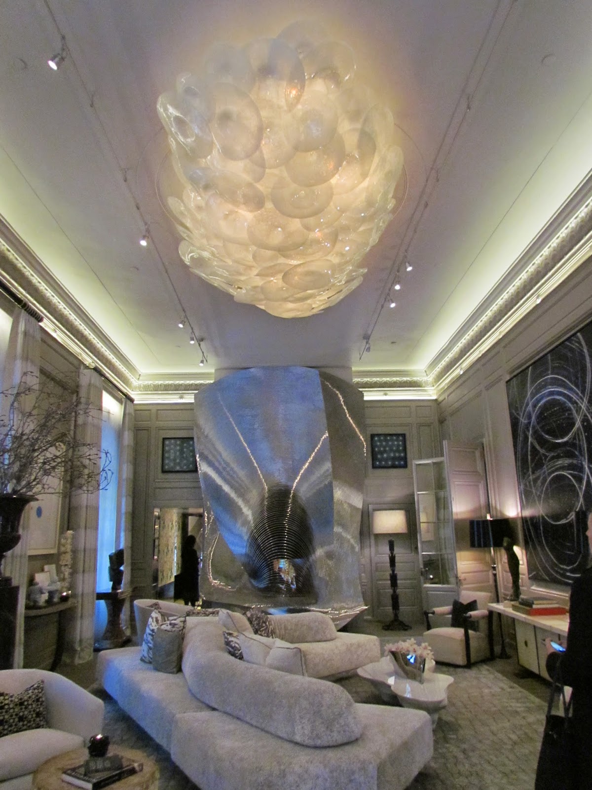
Tony Ingrao & Ingrao’s Creative Director Randy Kemper bring natures finest inspiration into every detail and selection made in this design.
 |
| image via (Architectural Digest) |
 |
| Ron Arad fireplace screen |
It is what you assemble in a room that makes it modern, even antiques can be modern when used properly. - Ingrao

Form and function, exquisite installation art, sculptural custom furniture and textiles all play a part in creating the harmony within this design.
"...The extraordinary fire screen by Ron Arad is a work of art itself as is the beautifully crafted chandelier by Jeff Zimmerman, the tables by Joris Laarman and John Lewis, the cabinet by Paul Evans, the dining chairs by Charpentier- all of which create an environment of powerful individuality brought into harmony by the soothing neutral palette of a classic room.." - Ingrao
 |
| “UNIQUE GALAXY CLUSTER”, 2013 is an illuminated sculpture / light fixture consisting of hand blown soda glass spheres, by Jeff Zimmerman |
JORIS LAARMAN’S CUMULUS TABLE, 2010 via Friedman Benda woven texture and nerve like steel and aluminum interwoven within resin to create this web like effect to great results.
 |
| Doris Leslie Blau crocodile rug, |
*all images, except where mentioned - (c) Jennifer Mehditash for Dec-a-Porter
Sun. - 12pm - 5pm
Mon., Wed., Fri., Sat 11am - 5pm
Tues. & Thurs. 11am - 8pm


0 Response to "Kips Bay - Part 2 - Layers of White "
Posting Komentar