My visit to the Kips Bay Decorator Showhouse begins with a few of the rooms that stood out for their "effortless" layering and elegant design schemes. Each very unique, with specific points of view, and yet a common thread - an attention to detail that is very much in keeping with the way I enjoy designing my clients' homes.
Gideon Mendelson, who I covered last year here on the blog with his design at the Westchester Showhouse took on an L shaped room, one that came with very few of the fabulous architectural details that so many of the other rooms benefited from, and creates a dream room for any woman.
 |
| Gideon Mendelson |
"Today’s woman is very busy. She not only runs her household, but often her own company. She sits on Boards and chairs committees. She’s an organized hostess, a reliable friend, and an involved parent. And, sometimes, she needs a break!
The “Lady’s Lair” has been designed for her."
 |
| image courtesy - Kips Bay |
The irregularity of the space allowed us to create distinct functional areas.
For work, the central, prominent desk speaks directly to a personal assistant’s workstation, ... When a friend drops by for a chat, or one of the kids needs to talk, the settee is the perfect place to curl up. But if some peace and quiet is needed, a comfortable chair by the fire promises relief. - Gideon Mendelson
 |
| Image courtesy - Kips Bay |
 |
| Juan Montoya’s in his space |
Colombian born Juan Montoya is one of New York's most acclaimed designers and in visiting his space here, one can understand why.
His sensitivity in describing the selection and care of each finish for the walls, the custom fireplace surround, the cornice - in fact each architectural detail within this space emphasizes why I have chosen to include him in this post.
One would assume that each wall and element was existing, but in fact each layer was added by Juan and his team in order to recreate the sense of scale and history that would be more visible in some of the other rooms in the house.
Modern art, skillfully placed with a great emphasis on the lighting to create the maximum impact.
 |
| State of the Art Wood Flooring; Stark Carpet; Metalworks, Inc. Steel desk |
The custom sisal rug, inset within the wood floor boards and with leather inserts at opposing ends, just make the most ordinary of flooring material a sensational selection.
 |
| Anthony Lawrence – Belfair drapery fabric; Textures 3D Panels®; Friedman Benda Console; |
The work by artist Olga de Amaral is placed against this custom plastered wall - a sculptural foundation for this artistic expression which in of itself is laced with texture, is a great example of how layering textures can achieve a very sophisticated simplicity.
 |
| Manhattan Shade & Glass; Maison Gerard mirrors, |
The modern and the traditional live in harmony within this space, it is all about the sense of scale and proportion in the highest quality selection of materials and objects.
 |
| Young Huh in her room |
No grandma's floral here - this is all very NOW.
 |
| Maya Romanoff (Ceiling Paper) - Jean Karajian Gallery table - John Salibello chandelier |
 |
| Kravet (velvet) |
 |
| "HOLLYHOCK" Lee Jofa (Upholstered walls) - Patent Leather (Kravet) |
 |
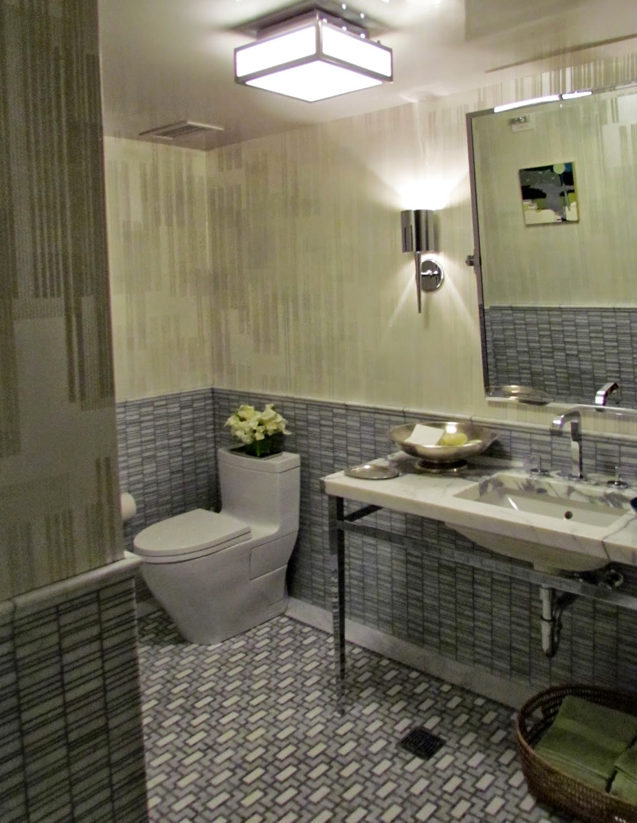
| AKDO tiles./ Axor /Urban Archaeology fixtures / custom paint finish |
It's the way she has mixed the patterns, the scale and the finishes that makes this room unforgettable... looks effortless, and yet so many details and thought have been put into every element.
 |
| AKDO tiles / Duravit / Alpha Workshops wallpaper |
 |
| Massimo Listri art; Image courtesy - Kips Bay |
According to Alexa Hampton, of Mark Hampton, it all began with this custom designed wallpaper produced by Duggal: Audio Visual Solutions handpainted pattern by Chuck Fisher.
".. I wanted to play with a different set of ideas {from my last Kip's Bay design}. The room started with the inspiration of Mudejar flavored tile walls.." - Alexa Hampton
 | |||
| (desk) Objects Plus / Daniel Barney; Pair Desk Chairs 145 Antiques; |
Many of these items were sourced by Alexa online, or at various "vintage" shops including chinese lanterns that she fitted to create a custom chandelier which fits perfectly within the scale and cheery atmosphere of this room.
 |
| Franklin Tartaglione art; |
 |
| Chaise - 145 Antiques; |
Not necessarily East meets West, but more of an East meets East as she plays with various styles and themes interweaving them in a masterful way to create this very colorful and elegant room.
"I hope the room’s traditional elements are met with a jolt of playful modernism" - Alexa Hampton
 |
| Chuck Fischer hand painted tile on printed wallpaper |
So much more to share from my visit to Kips Bay over the course of the next few weeks - but I do suggest you visit as it is one of the greatest showhouses every year. The teams have all put in so much effort into every design and the location is magnificent. Do not miss it!
*all images, except where mentioned - (c) Jennifer Mehditash for Dec-a-Porter
Sun. - 12pm - 5pm
Mon., Wed., Fri., Sat 11am - 5pm
Tues. & Thurs. 11am - 8pm


0 Response to "Kips Bay Showhouse - Part 1 - Layers of Elegance"
Posting Komentar